Ceros
CLOUD BASED CONTENT CREATION STUDIO
Ceros
Ceros is a platform for creating stunning interactive content that engages your audience, without writing a line of code. An end-to-end solution for content creators, the studio offers complete creative control. Published content is seamlessly hosted and everything is tracked through the analytics dashboard.
Role
As a product designer at Ceros, I planned the product roadmap and advanced the user experience for Ceros’ interactive content creation software. I researched, interviewed and tested flows and features with in-house design agency, in-bound and out-bound sales teams, and external clients. Due to the variety of client industries, specificity of workflows, and deliverables created in Ceros, platform flexibility and in-person meetings with high profile clients were crucial to understand specific needs and determine priority of features implemented and improved.
Releases & Communication
We identified that the flexibility, plethora of features and possibilities of the platform were overwhelming to new clients. To help onboard new clients, and update existing clients, we created an educational hub with starter templates, case studies, and online courses. Updates were released weekly, and communicated through blog and email to update customers on new features and improvements. Depending on the update, I would contribute by writing copy, creating supporting gifs or videos.
RAPID & INTIMATE FEEDBACK
Ceros has an in-house design agency that is separate from the product team. The in-house agency creates content using the platform for clients who may not have the design capabilities to create things from scratch. It was helpful to be able to walk over and watch Ceros designers use the platform with workarounds to circumvent technical bugs, novel ways to combine features and create interactions that I had not intentionally designed, and to see their process from start to finish. They were experts in the platform, and getting quick feedback on prototypes of new features was a constructive contrast from the new clients who were just learning how to use the platform.
Groups & Folders
I designed new icons for the Layer Panel and Toolbar. This required researching what users expected from each icon, and was highly dependent on users' preferences and experiences with other creative software like Photoshop, Illustrator, or Sketch. This required extensive analysis in grouping interactions and their purposes in different applications, and understanding users’ mental models and expected behaviour. I went through many iterations to ensure the grey colours were balanced correctly to emphasise hierarchy, and ensure clear display across various devices.
We updated the options to simplify, clarify and improve the tools you have to keep your content organised. Aside from making the icon styles more consistent with the rest of the studio, the addition of supporting icons in the Layer Panel help to quickly identify and find the elements users are looking for in your Layer Panel list.
Hubspot integration
Hubspot forms allow clients to convert anonymous website visitors into leads and manage the information in the Hubspot CRM. I worked on integrating the Ceros Studio with Hubspot so that users could insert Hubspot forms inside their interactive content. Specifically for the Ceros platform, clients could then create gated content, where users had to fill out a form before proceeding to the rest of the content.
The integration allows users to drag and drop forms onto the canvas, resize them, and view the input fields. The challenges were to find a way to display the forms concisely since users often had hundreds of forms in their Hubspot account, containing similar fields, so locating the correct form was limited by users’ naming conventions. Scaling of forms inside the integration panel was another important consideration, since forms could vary intensely in length. Design was limited by the software stack Ceros, web browser limitations and the Hubspot api.
Initial iterations contained various ways to sort the forms, with the intention of having a search field implemented later. In the case of gated content, where users could not view the next piece of content without first filling out a form, I designed the flow of linking the gated content to the public content.
ANIMATIONS & INTERACTIONS
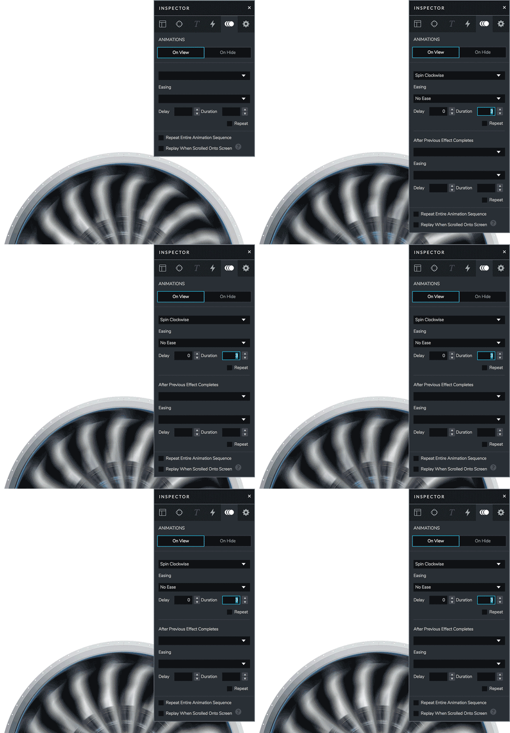
The Ceros studio allows users to set up interactions and animations on objects. I interviewed designers from both Ceros’ in-house design agency and external clients to see how they were currently using hide, show and hover interactions, and identified points where the results of the interactions they setup were incongruous with expectations. I looked animation and interactions setup processes from other softwares such as Keynote and Framer.
I also evaluated what desired interactions users wanted to setup that did not currently exist, and bugs that prevented certain combinations of animations and interactions to fail. I tested prototypes with in-house designers and tweaked wording nuances that were causing confusion.
I created the ability to edit the hover zone to a specific shape, which opened up possibilities for content such as infographics.
We added the ability to Hide objects On Hover and additionally added options to choose between a toggle like behaviour or a one-time action. The goal is to give users more choices and flexibility to create, yet limit options just enough increase user understanding.
Show: the target of the interaction will only be visible when the user’s mouse is over the trigger.
Show and Stay Visible: the target of the interaction will appear when the mouse is rolled over the trigger and it will remain visible when the mouse moves away. It’s a one time action, but you also have an additional option, Repeat when scrolled on screen, that will reset the interaction each time the trigger comes back into view.
Hide: the target of the interaction will only be hidden when the user’s mouse is over the trigger.
Hide and Stay Hidden: the target of the interaction will disappear when the mouse is rolled over the trigger and will remain hidden when the mouse moves away. This is a a one time action with the additional option to Repeat when scrolled on screen.
Single Sign-On
I worked closely with engineers to implement both password authentication and enterprise SSO using identity standards: LDAP, SAML, and OAuth. Once SSO is enabled, users have passwordless login with Ceros. After entering your username or email, Ceros will recognize your domain and the password field will disappear.


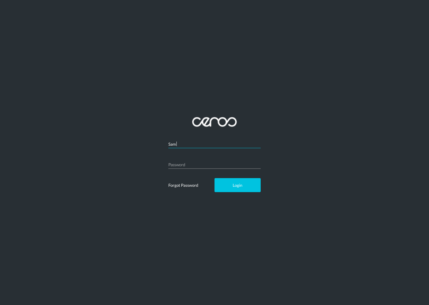

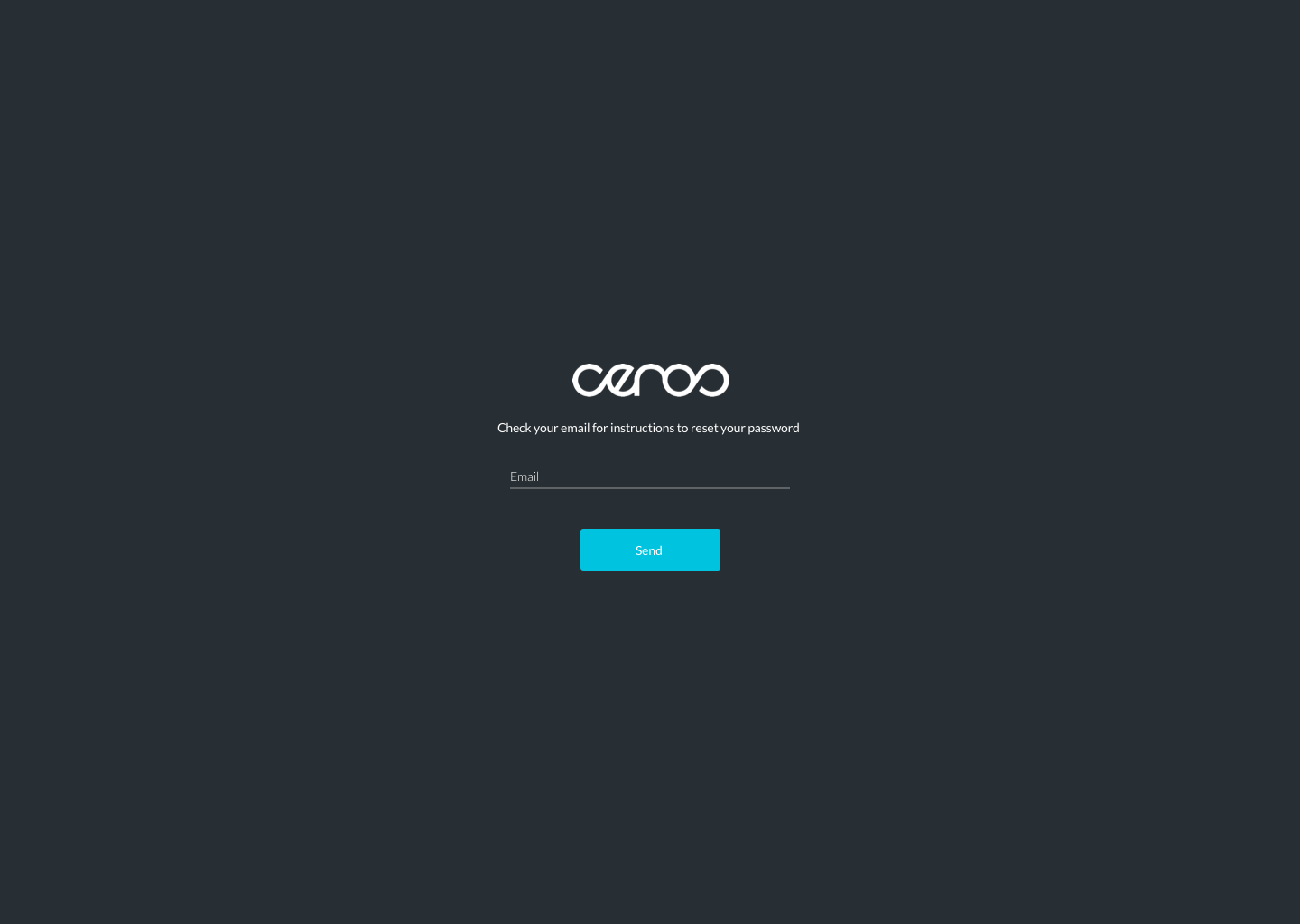
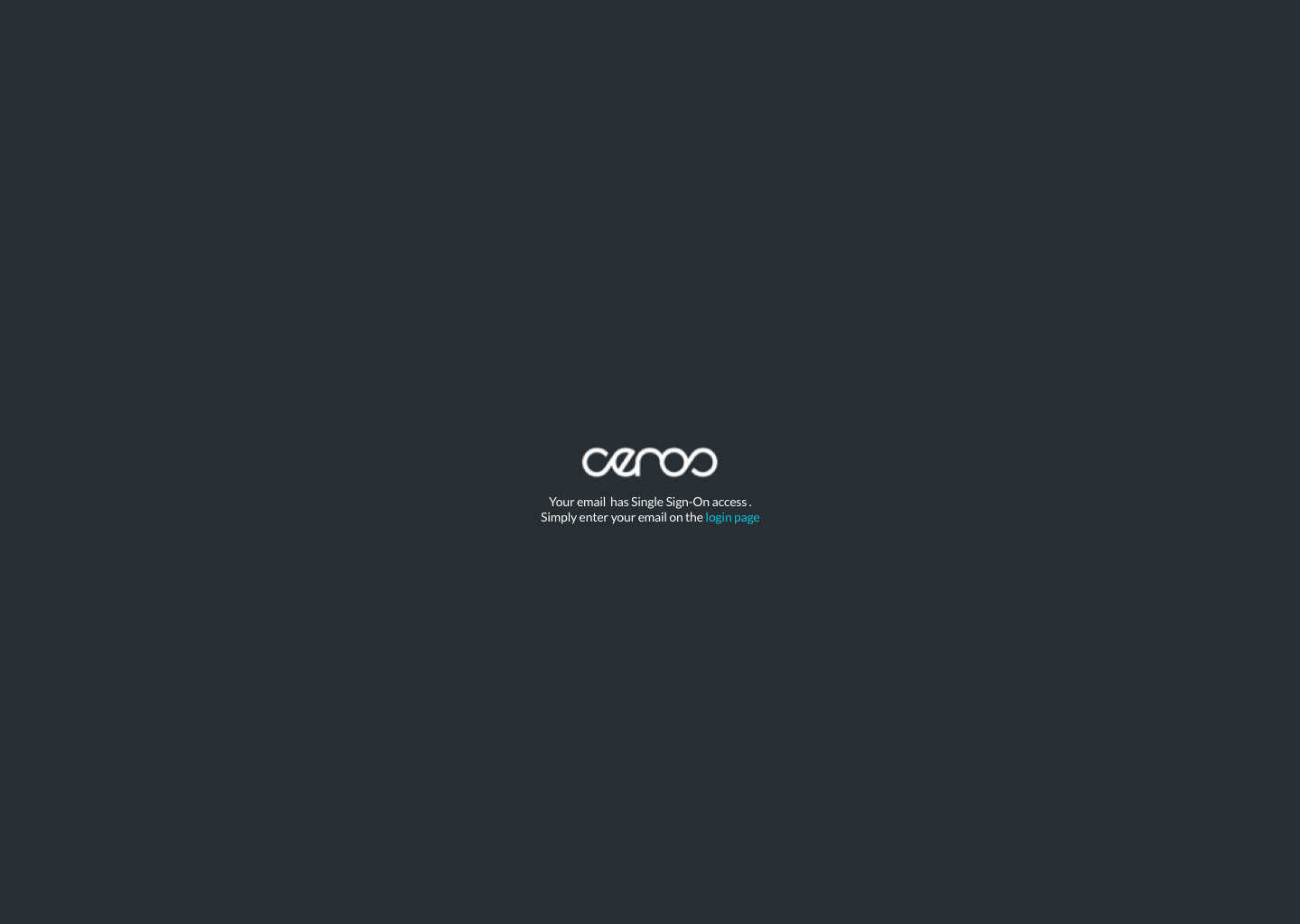
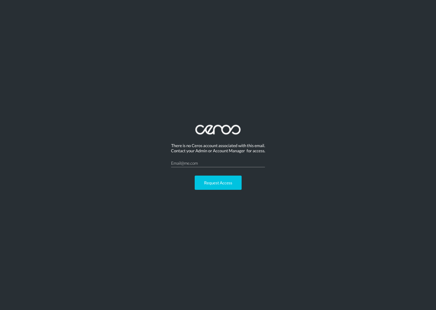
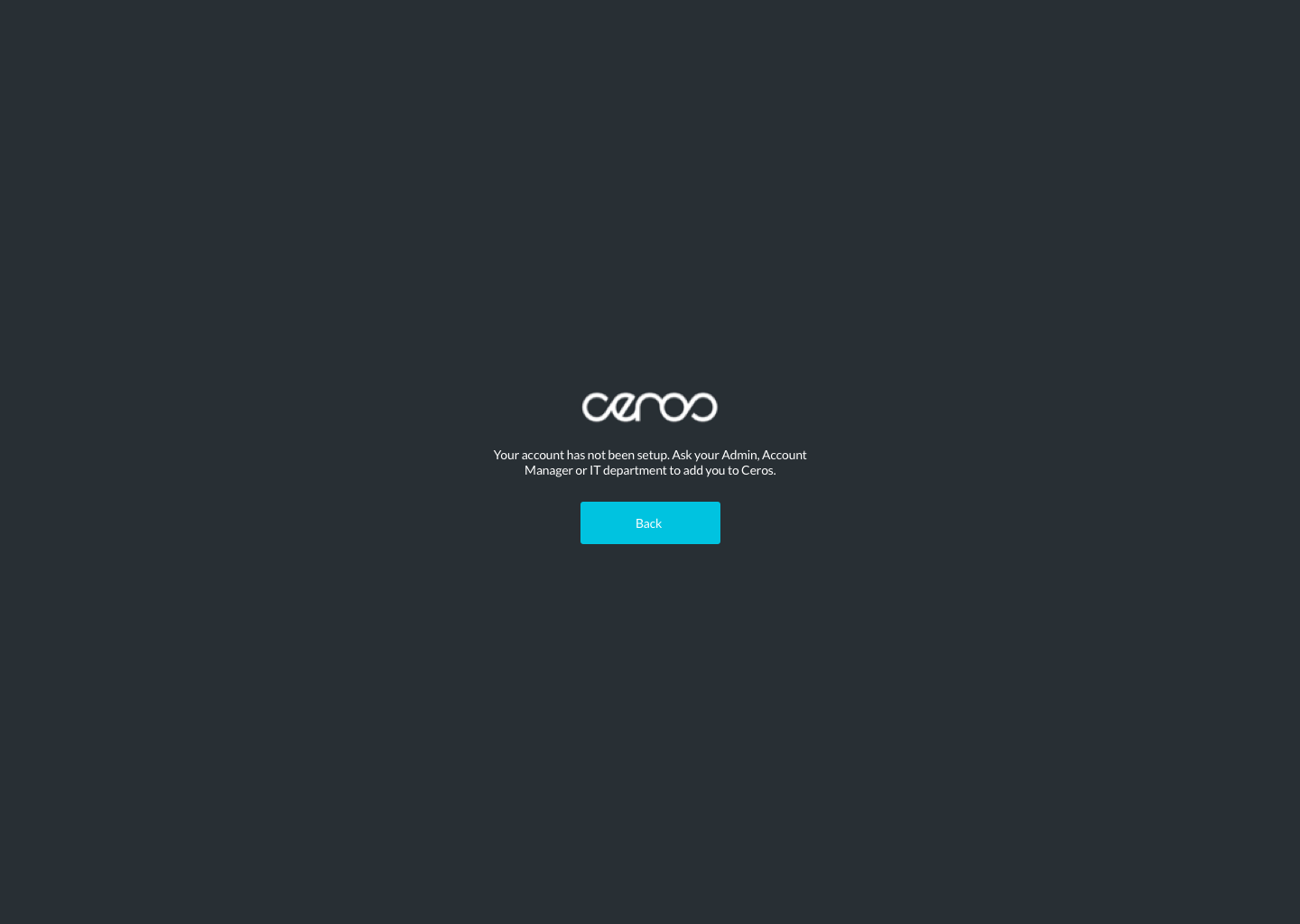
Ceros used a seat-based model as well as an unlimited user-model pricing. Since users needed to work with their ceros account manager to setup SSO, we designed for the following states:
Valid user email, but no seat
Valid user email, request for SSO sent —> request confirmation page
SSO enabled login, but forgot password —> password reset confirmation page

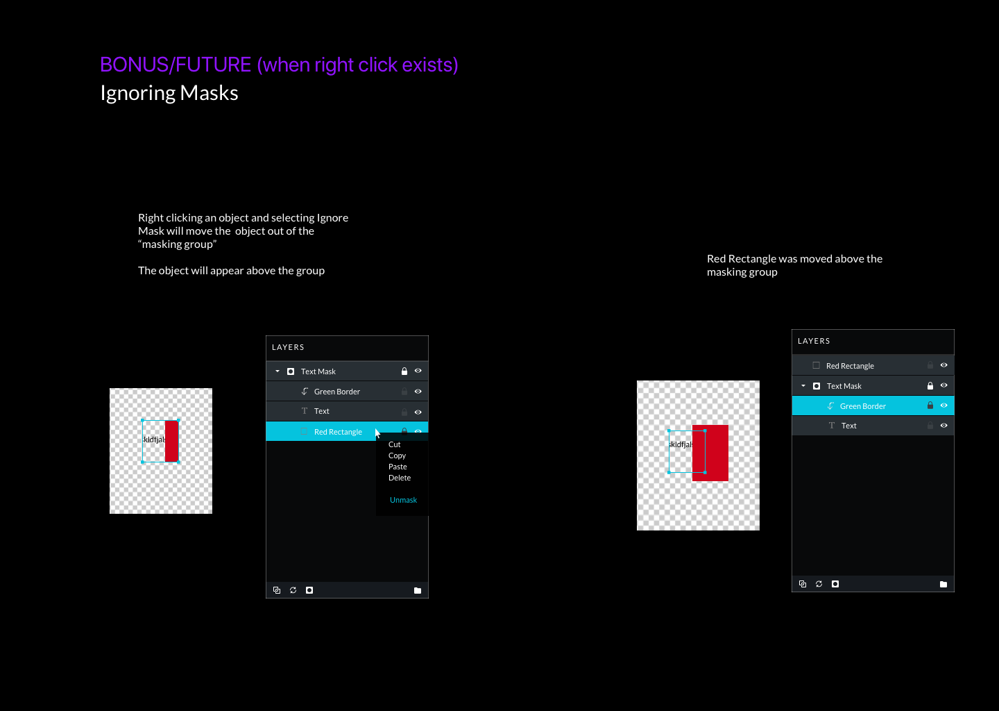
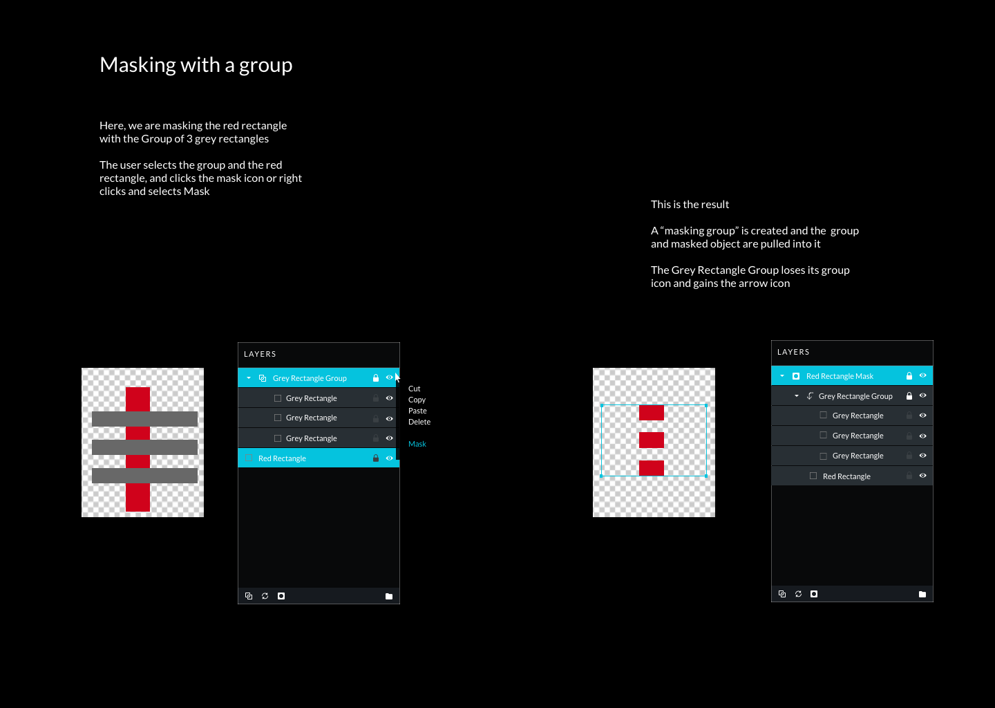
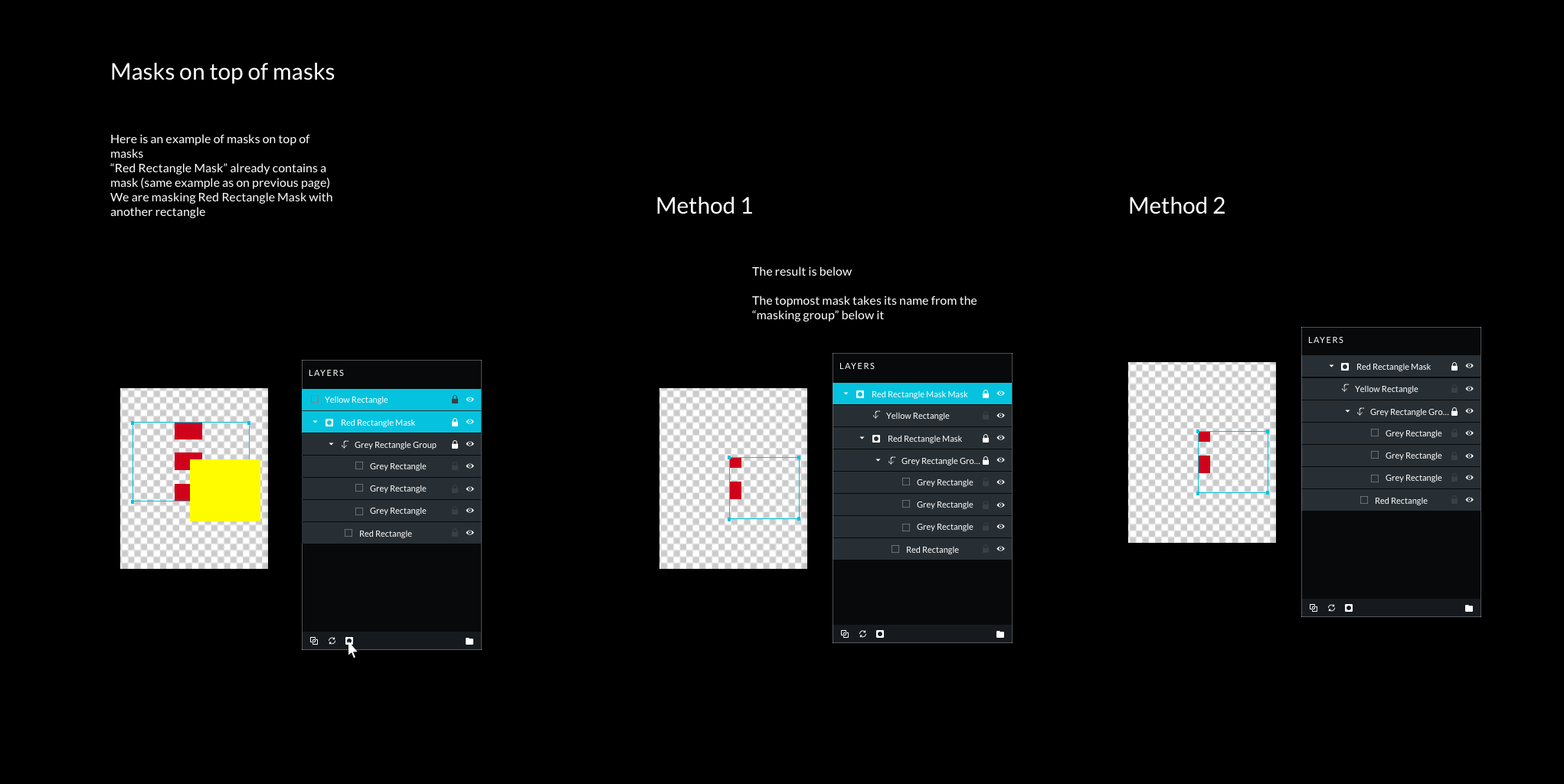
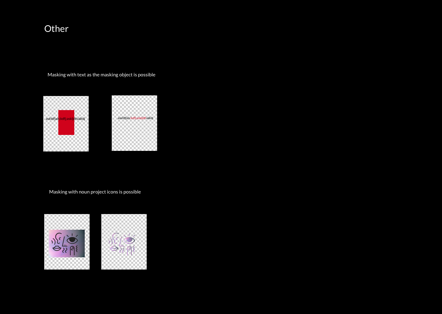
Masking
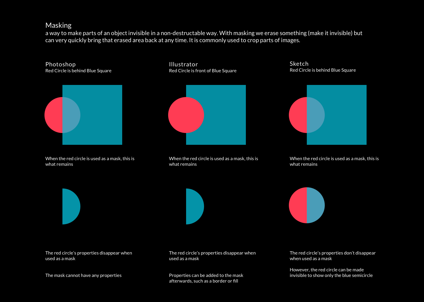
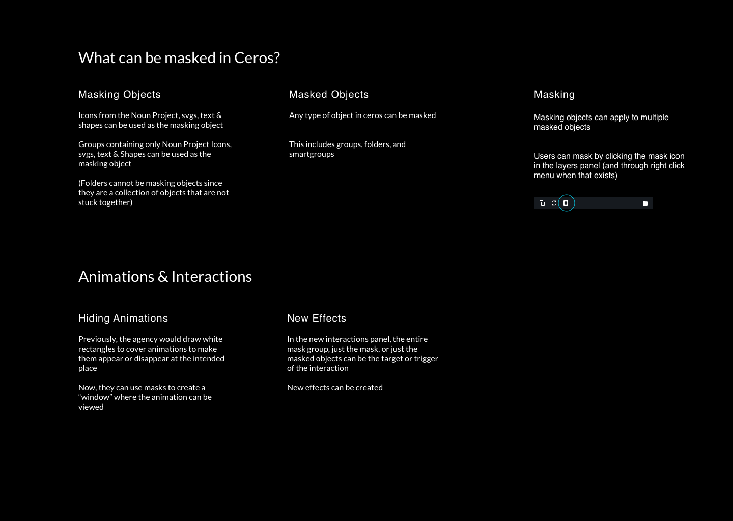
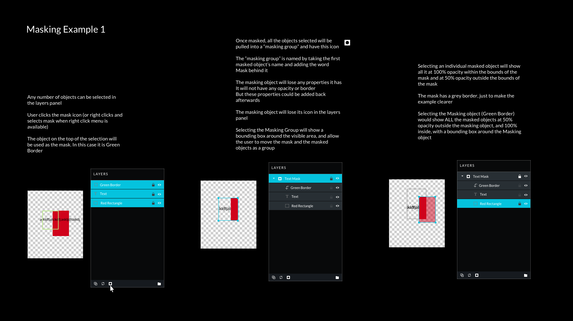
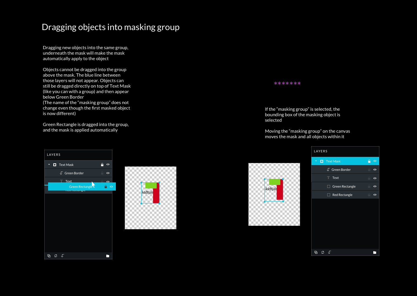
We wanted to add masking as a new feature, so we started with research of users’ understanding of masking in other platforms, and then seeing how it could work in Ceros. I tested potential flows for masking within the Ceros platform and got feedback from our in-house design agency.
